Creating Choices
It is very simple to create a range of choices for a product in Actinic. To do this, you create an 'Attribute' within a product and then create a number of 'Choices' within that attribute.
Note: You can also create attributes and choices within a 'Component' in order to assign a different price for each choice, or in order to associate a choice with another product in your store. For more information, see Making Customer Selection Affect Price and Stock Level.
Creating an Attribute
Highlight the product/component that you want to create some options within and do one of the following:
· Right-click and select 'New Attribute'
· Press [Ctrl + I]
· Go to 'Edit | New Attribute'
You will first be required to give the attribute a name.
Once you have done that, double-click on the attribute (or press [Enter] on the keyboard) in order to edit the details of the attribute. The settings you will see within the 'General' tab are as follows:
|
Field |
Meaning |
|
Attribute Name |
The name for the attribute. |
|
HTML for Name |
Enter text here for how you want the attribute to be labelled within the store pages. You can add HTML into this field by using 'Embedded HTML' - see Embedding HTML for details. |
|
Type |
Actinic allows you to search on choice values in your store. Use this field to define whether the choices are 'Text', 'Integer' or 'Date' in order for the search tool to list them correctly. |
|
Category |
Select a category for your attribute (if you have created any). See Content Categories for more details. |
You can create any number of attributes within a product or component.
Creating Choices
Once you have created your attribute, you will need to create some choices within them. To do this, highlight an attribute and then:
· Right-click and select 'New Choice'
· Press [Ctrl + H]
· Go to 'Edit | New Choice'
You will need to give the new choice a name.
Once you have given it a name, double-click on it (or press [Enter] on your keyboard to edit it. The settings you will see are as follows:
|
Field |
Meaning |
|
Choice Name |
The name of the choice |
|
HTML for Name |
Enter text here for how you want the choice to be labelled within the store pages. You can add HTML into this field by using 'Embedded HTML' - see Embedding HTML for details. |
|
Category |
Select a category for this choice, if you have selected one. See Content Categories for more details. |
You can create any number of choices within an attribute.
Remember, you can use drag and drop to change the order of them.
Choosing Layouts for your Attributes and Choices
Within the 'Layout' tab of an attribute, you can select the layout for the attribute. By default, the attributes and choices will be laid out as a drop-down list, but you have the choice of changing these to radio buttons, or a set of push buttons.
The two standard layouts to choose from are as follows:
|
Layout |
Description |
|
Standard Drop Down Attribute |
Inserts the attribute name and a list of choices as a drop down list into the design. |
|
Standard Radio Button Attribute |
Inserts the attribute name and a list of choices as radio buttons into the design. |
You can also set the number of columns that radio buttons and appear in by editing the 'Column Count For Radio Buttons' field.
If there are any tabs or settings here that are not detailed in this help file, it is because they are 'user-defined settings' that have been added to Actinic. For an explanation of user-defined settings, see Making Changes in Actinic.
Push Button Grids
It is possible to layout your attributes within a 'push button grid' rather than just drop-downs or radio buttons. One of the advantages of push button grids is that it is possible to put two sets of choices together to create a table of push buttons.
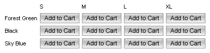
In order to activate push buttons, change the value in the 'Attributes in Push Button Grid' field in the 'Properties' tab of your products. This will override any layouts you have entered for your attributes.
There are a few restrictions on the 'Push Button Grid' options for attribute layout:
· If you have more than one attribute within a product/component, push button grids will only be used for the last attribute, or the last two attributes.
· If the 'Shopping Mode' for the section is set to 'Single Add To Cart Button per Page', then these push button grids will not work. For more information on shopping mode, see Changing The Shopping Mode.
Note: In order to change the text on the buttons in the grid, you need to edit the 'Text For Cart Button' field in 'Site Options | General'.